THE PALETTE
#000000
#FFFFFF
#8B0000
#305364
TYPOGRAPHY
Typography is a fundamental element of our brand identity. The fonts we’ve selected carefully reflect our brand’s personality and enhance the overall visual experience. By using these fonts consistently, we ensure a cohesive and professional look across all our marketing materials.
In this section, we’ll delve into the specific fonts that comprise our brand’s typography system. Each font has been chosen to complement our brand’s unique character and evoke the desired emotions.
Fashion

This is a custom font created by Adam McClain in an attempt to make a visually compelling and minimalistic typeface for the brand, BORDERLINE. Using curves and sharp points, while also creating implied lines through the shapes. This font is strictly for the fashion side of things.
.png)
Designs
For other design elements, such as graphic design, we try to prioritize the following fonts, BIG MONKEY, GRANITE, BREAK AGE GRAFFITI, DOCALLISME ON STREET, and a few other similar style fonts.
.png)
.png)
.png)
.png)

Additional Fonts
Cinzel
a b c d e f g h i j k l m n o p q r s t u v w x y z 1 2 3 4 5 6 7 8 9 0
This font is used primarily on the web for bigger text such as headers, titles, and short phrases or slogans. Not to be used for important long text.
Questrial
Aa B C D E F G H I J K L M N O P Q R S T U V W X Y Z 1 2 3 4 5 6 7 8 9 0
This font is also primarily used on the web for longer paragraphs and any important text not including headers, titles, or short slogans.
Lato Thin
Aa B C D E F G H I J K L M N O P Q R S T U V W X Y Z 1 2 3 4 5 6 7 8 9 0
This font is primarily used for designs such as posters, or an artistic exploration pieces with no particular font requirements for the art itself. Most artistic fonts are left at the discretion of the creator.

SPLITTING
For this design I wanted to talk about an effect known as, Splitting, which is most found in split personality disorder, bipolar disorder, and several others. Image wise, I wanted to showcase the state of mind through the 4 skulls, and how each skull may represent a different version of ones self. As you can see the skulls on the right are clean edges, almost smooth in their pencil strokes, with lots of curves. There are often no straight lines found in nature which may make this side of the design seem more natural or normal and would represent the primary or most normal states of mind within that individual. On the left side the lines are more jagged with straight edges and almost unsettling and distorted. This would represent how some states of mind or those other versions of one's self, are not always clear with their intent or what they plan to do. In between the two designs there are smooth strokes that connect the two sides, but with holes between them, showing that there are certain pathways the brain takes to get from one mind state to another. These lines are fluid which show they can often change and are not entirely set in stone. This shows that those pathways can be accessed by many different things, such as a trigger to a trauma response, an emotional response, or being in a specific place or environment. Since these lines are fluid and not set in stone, they often can change as you may overcome one thing, that pathway may disappear or receive less traffic, but that also means as you continue to live, new pathways may also form. Often these pathways may change, but there is no known cure, to either merge these states of mind into one, or to rid of some entirely.
.png)
.png)


INTRODUCTION
Borderline is more than just a brand; it's a movement. We're dedicated to fostering a community that celebrates the diverse facets of design. From the intricate lines of a drawing to the bold strokes of a street art mural, we believe that design has the power to evoke emotion and spark conversation. By blending traditional and digital techniques, we create visually striking pieces that challenge norms and inspire creativity.
VISUAL IDENTITY
Our visual identity is the cornerstone of our brand's recognition and appeal. It is a carefully curated collection of visual elements that work together to create a cohesive and memorable brand experience.
This section delves into the key components of our visual identity, including our logo, color palette, and typography. By adhering to these guidelines, we ensure that our brand's visual language remains consistent and impactful across all platforms and applications.


.png)


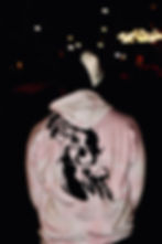

SHOP APPERAL
VOLUME 11.17.24